An accessible website is one that everyone can use, including people who are blind or have low vision, people who can't use a mouse, people who are deaf or hard of hearing, and people with cognitive disabilities. In the US, about one in four adults has some kind of disability, so this isn't a small group of visitors.
Accessibility also protects your business. Website accessibility lawsuits and demand letters against small and mid-sized businesses have become common. This guide explains the basics in plain English and shows what to fix first.
This is general information, not legal advice. If you've received a demand letter, talk to a lawyer.
How the ADA applies to websites
The Americans with Disabilities Act (ADA) requires businesses that are open to the public to be accessible to people with disabilities. The US Department of Justice has said this includes their websites.
There's no detailed technical rule for private business websites in the regulations yet. In practice, the standard most people use is the Web Content Accessibility Guidelines (WCAG) 2.1, level AA. It's what accessibility experts test against, and it's what most demand letters refer to.
Some states have their own rules too, so if you sell across the country it's worth getting the basics right everywhere.
The problems we see most often
Most small business sites fail on the same handful of things. The good news is that most of them are quick to fix.
1. Images without descriptions
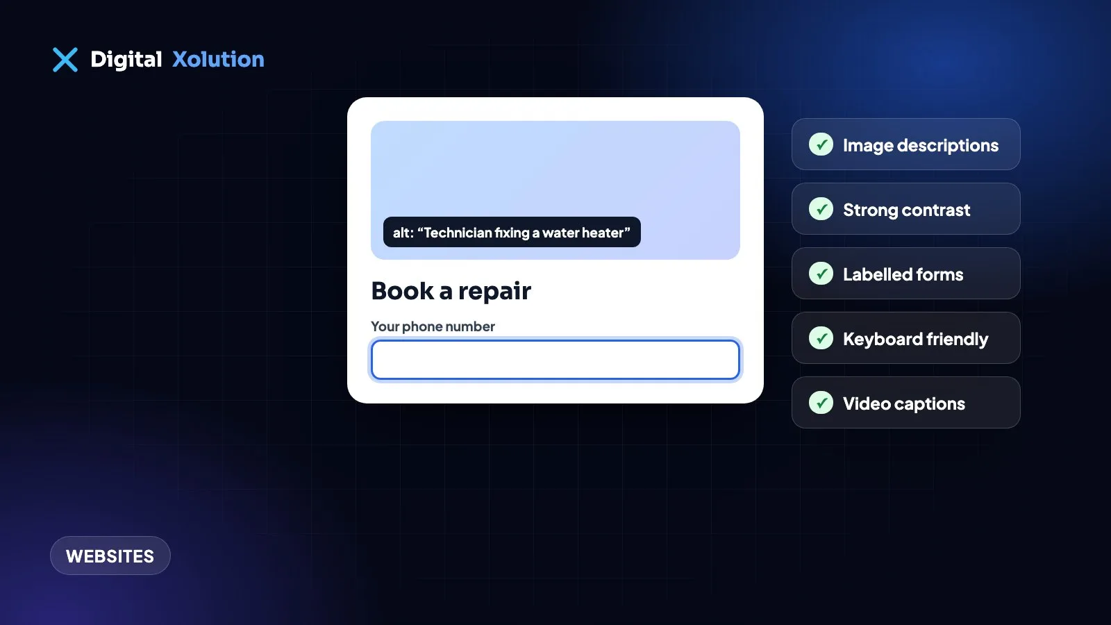
Screen readers read out a short text description of each image (its "alt text"). Without it, a blind visitor hears nothing, or a file name like "IMG_4021.jpg". Describe what matters: "Technician fixing a water heater", not "image". Purely decorative images should have empty alt text, so they're skipped.
2. Low colour contrast
Light grey text on a white background looks stylish and is hard to read for many people, especially on phones in sunlight. Body text needs strong contrast with its background. Free contrast checkers will tell you in seconds.
3. Forms without labels
If a form field only has placeholder text inside it ("Your name"), a screen reader may not announce it, and the hint disappears when someone starts typing. Every field needs a proper label. Error messages should say what went wrong in words, not just turn the box red.
4. Things you can't reach with a keyboard
Some people navigate with the Tab key instead of a mouse. Try it on your own site: can you reach every menu item, button and form field? Can you see where you are on the page? Pop-ups that you can't close with the keyboard are a common trap.
5. Unclear links and buttons
"Click here" and "Learn more" repeated ten times mean nothing when a screen reader lists the links on a page. Use words that make sense on their own: "See our drain cleaning prices".
6. Headings used for looks, not structure
Screen reader users jump between headings to skim a page, just as sighted people do. Use one main heading per page, then subheadings in order, rather than picking heading styles because of their size.
7. Videos without captions
Videos need captions for people who are deaf or hard of hearing, and they help everyone watching with the sound off. Auto-captions are a start, but check them for mistakes.
8. PDFs that are just scans
Menus, price lists and forms uploaded as scanned images can't be read by screen readers. Put the important information on the page itself, or use an accessible PDF.
Do accessibility widgets make a site compliant?
Accessibility toolbars and "overlay" widgets add buttons for bigger text, higher contrast and similar options. They can be helpful extras for some visitors. They don't fix the underlying problems like missing labels, keyboard traps or images without descriptions, and businesses using them still receive demand letters. In 2025 the US Federal Trade Commission fined one widget company over claims that its product could make any website compliant.
Use a widget as an extra if you like, but fix the website itself.
How to check your website
- Run a free automated test. Tools like WAVE or Lighthouse in Chrome find many common issues in minutes. They catch only some problems, but they're a good start.
- Try the keyboard test. Put your mouse away and use Tab, Shift+Tab and Enter to complete your main task, such as sending the contact form or booking.
- Zoom to 200%. Does the page still work, or do things overlap and disappear?
- Listen to a page. Turn on VoiceOver (Mac and iPhone) or NVDA (free for Windows) and try your home page and contact form.
- Get an expert review for the pages that matter most if you have the budget, or if you've had a complaint.
What to fix first
Focus on the pages and actions that matter most to customers: the home page, your main service pages, the contact form, booking and checkout. Fix those, then keep accessibility in mind whenever you add new pages, images or videos.
Write an accessibility statement
Add a short page that says you're committed to accessibility, which standard you aim for, and how people can contact you if something doesn't work for them. Then answer those messages quickly. It shows good faith and gives visitors a way to reach you instead of leaving.
The bottom line
Accessibility is mostly good web design done carefully: clear text, proper labels, descriptions for images and a site that works with a keyboard. It helps every visitor, it often improves your search rankings, and it lowers your legal risk.
Not sure how your site measures up? Our website fixes service includes accessibility fixes, or get a free website audit to see the most important issues on your site.